Simplifying crypto to drive growth
Finoa, a leading European crypto custodian, unveiled a fresh brand. Yet, the product’s design felt outdated. Users struggled with an interface with complex navigation, incomplete reporting and unclear transaction flows. After a complete redesign, the experience became lighter and intuitive. Users could now handle their transactions with clarity and peace of mind, without second-guessing.
COMPANY / YEAR
Finoa 2022
INDUSTRY
Finance, Crypto
TIMELINE
12 months
CHALLENGE
The web app was untuitive, it felt complex and outdated. Finoa needed a modern, user-friendly, and engaging platform that simplified complexity, boosted trust, and scaled with new features. The main problems were:
Visual inconsistency with the new corporate identity.
Fragmented navigation made key actions hard to find.
Complex transaction flows (staking, transfers, deposits).
High cognitive load for non-expert users made operations hard to follow and execute.
RESULT
We restructured navigation, standardized transaction flows, and built a cohesive visual language that allowed scalability and future growth, and aligned with Finoa’s brand, vision and identity.
The web app users grew by 133%, from 300 to 700.
Frequent users of the platform jumped from 30 to 90.
Assets held on behalf of customers grew from 50% to a sizable 85%.
Customer satisfaction scores went from 78% to a remarkable 99% Net Promoter Score, for two solid years.
Process
COLLECT INFORMATION
First, I spoke with everyone involved (managers, builders, decision-makers) to get a handle on what the product should do, what roadblocks existed during building, also where people struggled.
After figuring out who our users are, we aligned on our user segments and customer profiles.

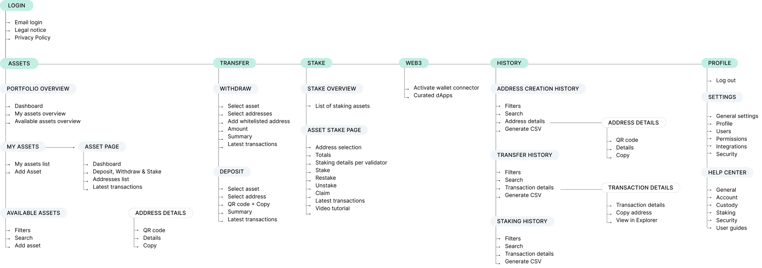
MAP THE CONTENT
I designed a comprehensive navigation map of the entire platform, showing every path alongside its structure. This helped uncover friction points in navigation, transactions, and portfolio management, clarifying where users struggled most and highlighting key areas for improvement.
USER TESTING
With initial wireframes and a clickable prototype, I ran two testing phases:
1. Internal testing: Gathered feedback from colleagues across departments to capture diverse perspectives.
2. External testing: Conducted usability sessions with target customers to validate flow clarity and navigation logic.
Here are a few of our user testing insights:
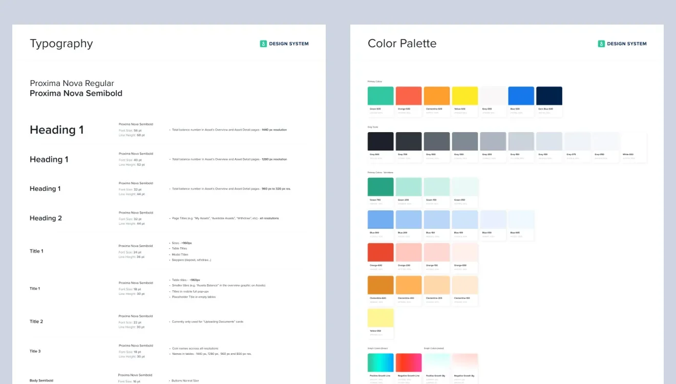
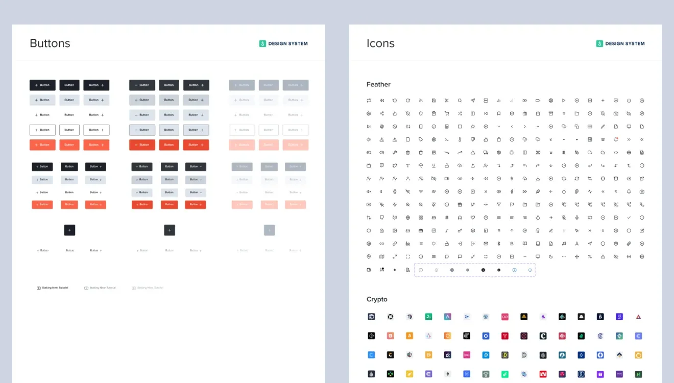
DESIGN SYSTEM
Once the structure and flows were validated, I translated the prototype into a polished interface aligned with the brand - one that truly felt like Finoa.
I crafted a unified design system, ensuring things looked cohesive and also making future growth easier. Working alongside with the frontend team, I delivered all components and style guides, so things transferred easily.

DESIGN ENHANCEMENTS
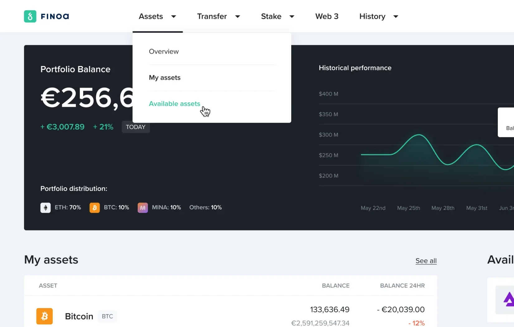
Simplified scalable navigation
I grouped features by type for a scalable, flexible app, organized in an horizontal navbar, informed by customer feedback on taxonomy and pain points.
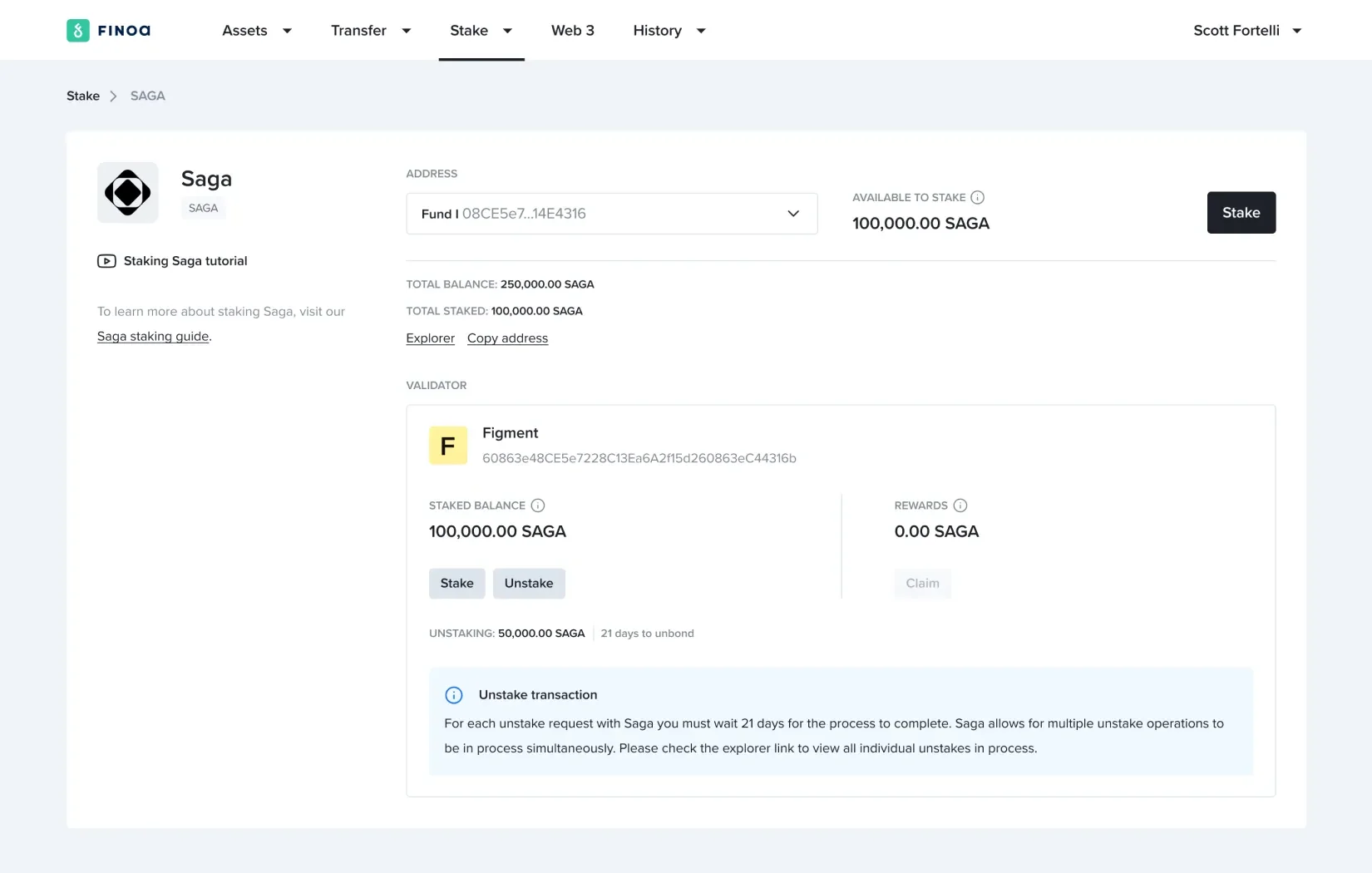
Quick access
Users appreciated the new structure but wanted faster access to key actions. We introduced quick actions (stake, withdraw, deposit) directly on the asset’s page.
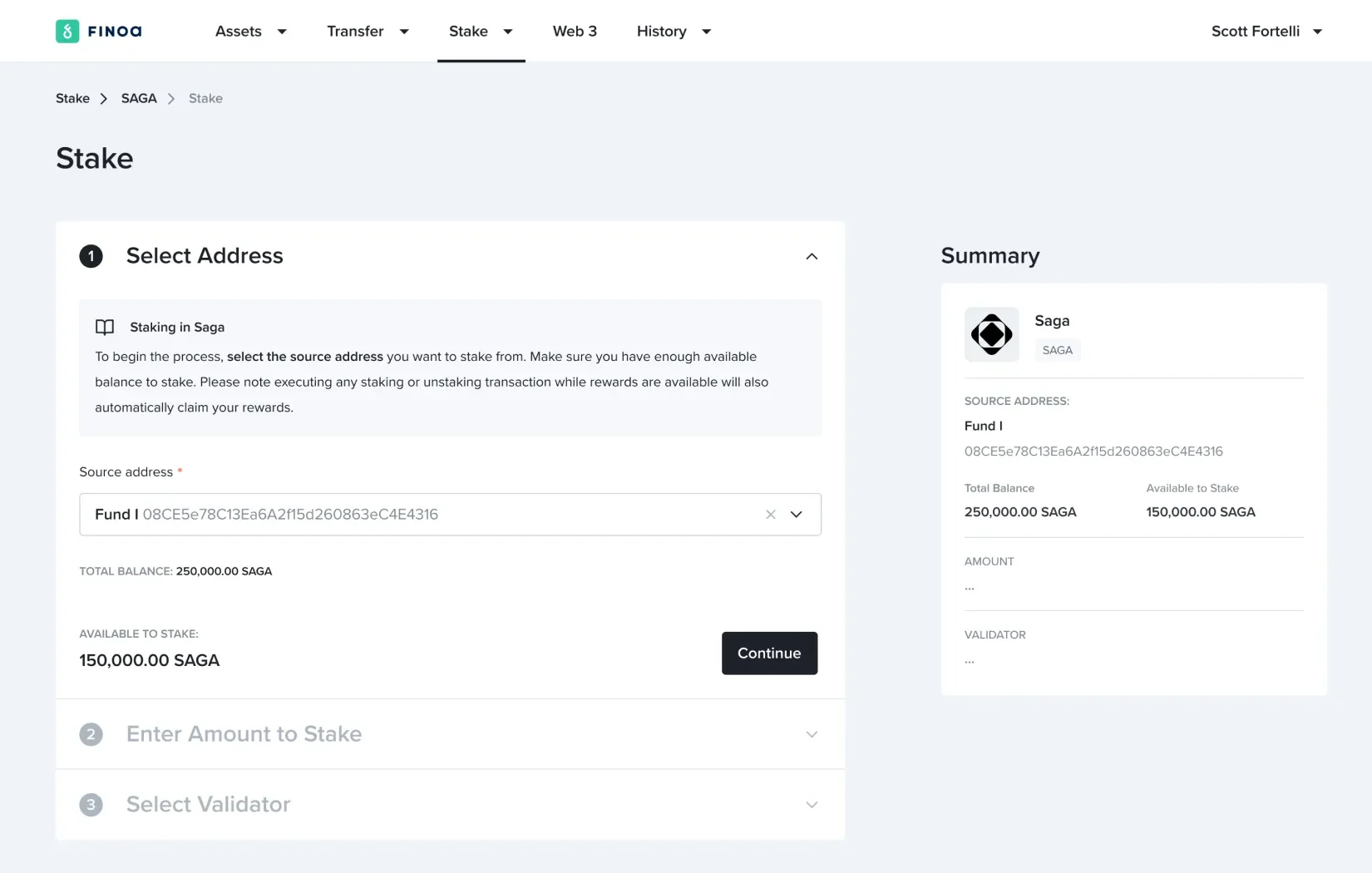
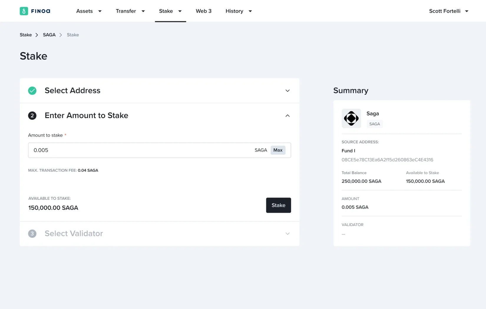
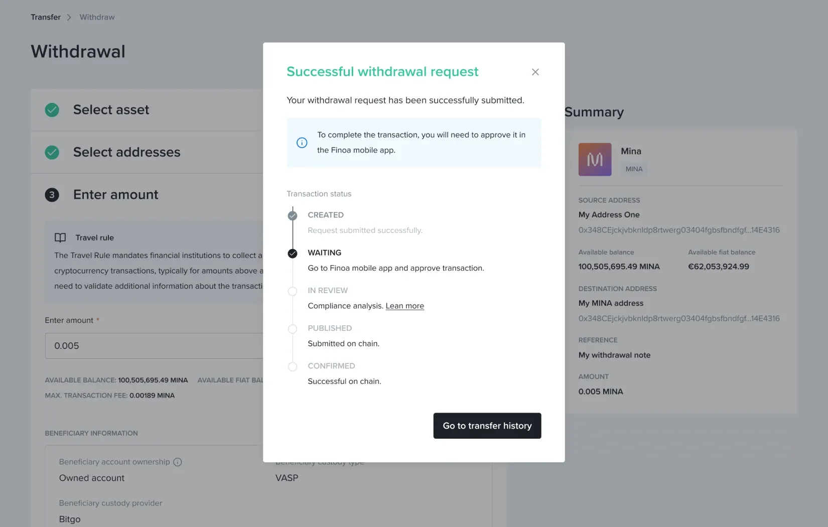
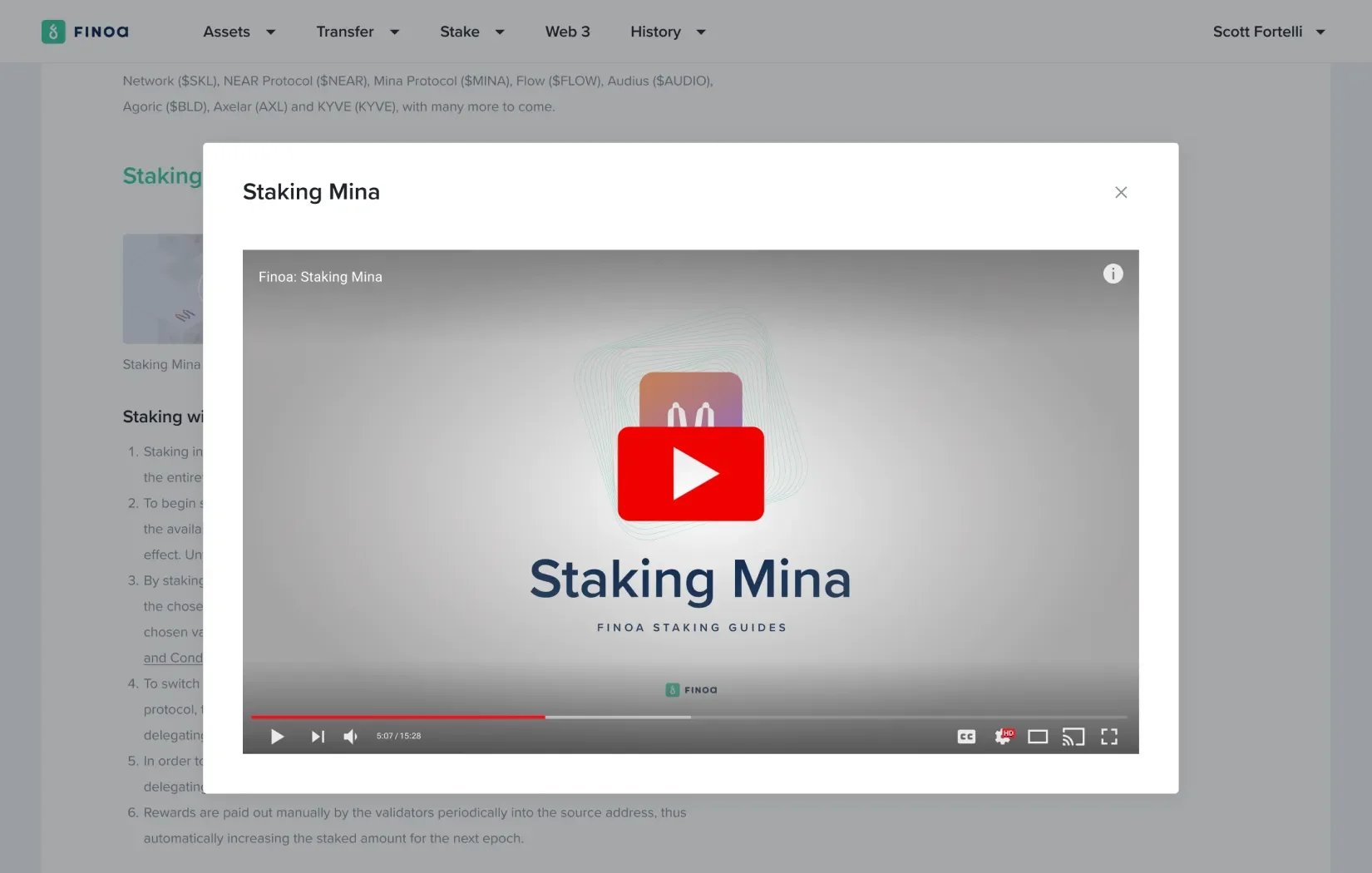
Step-by-step approach to staking and transfer operations
Each crypto asset has unique staking rules, so we created a flexible, consistent 3-step layout for fast implementation and minimal dev impact. The same approach applies to transfers, with a lateral summary that keeps processes clear, simple, and easy to navigate.
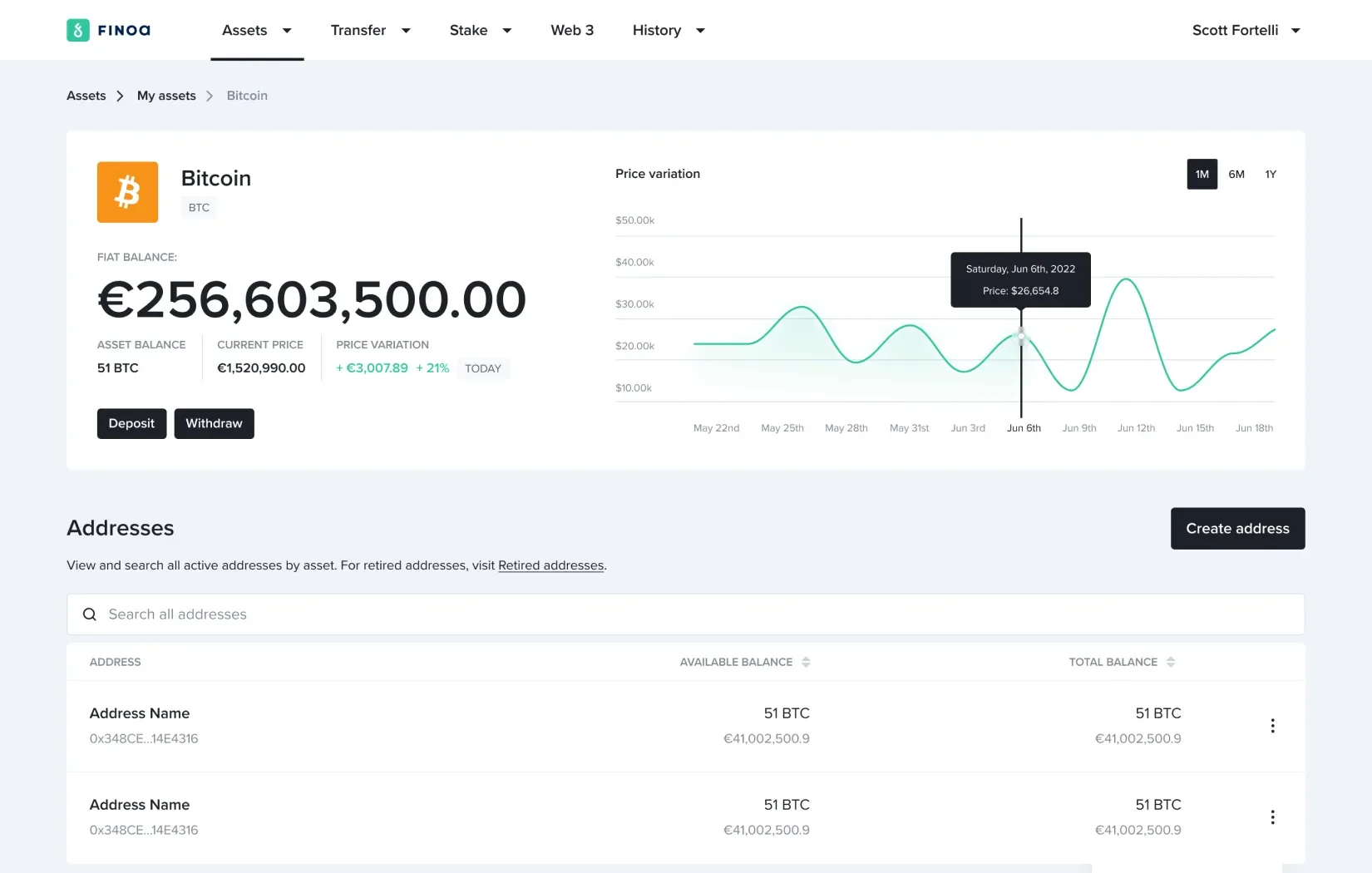
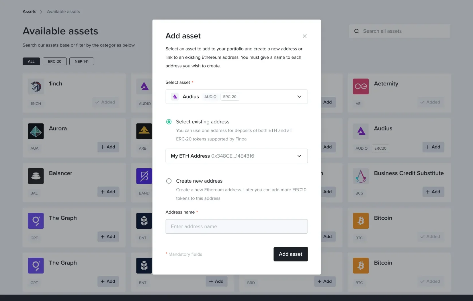
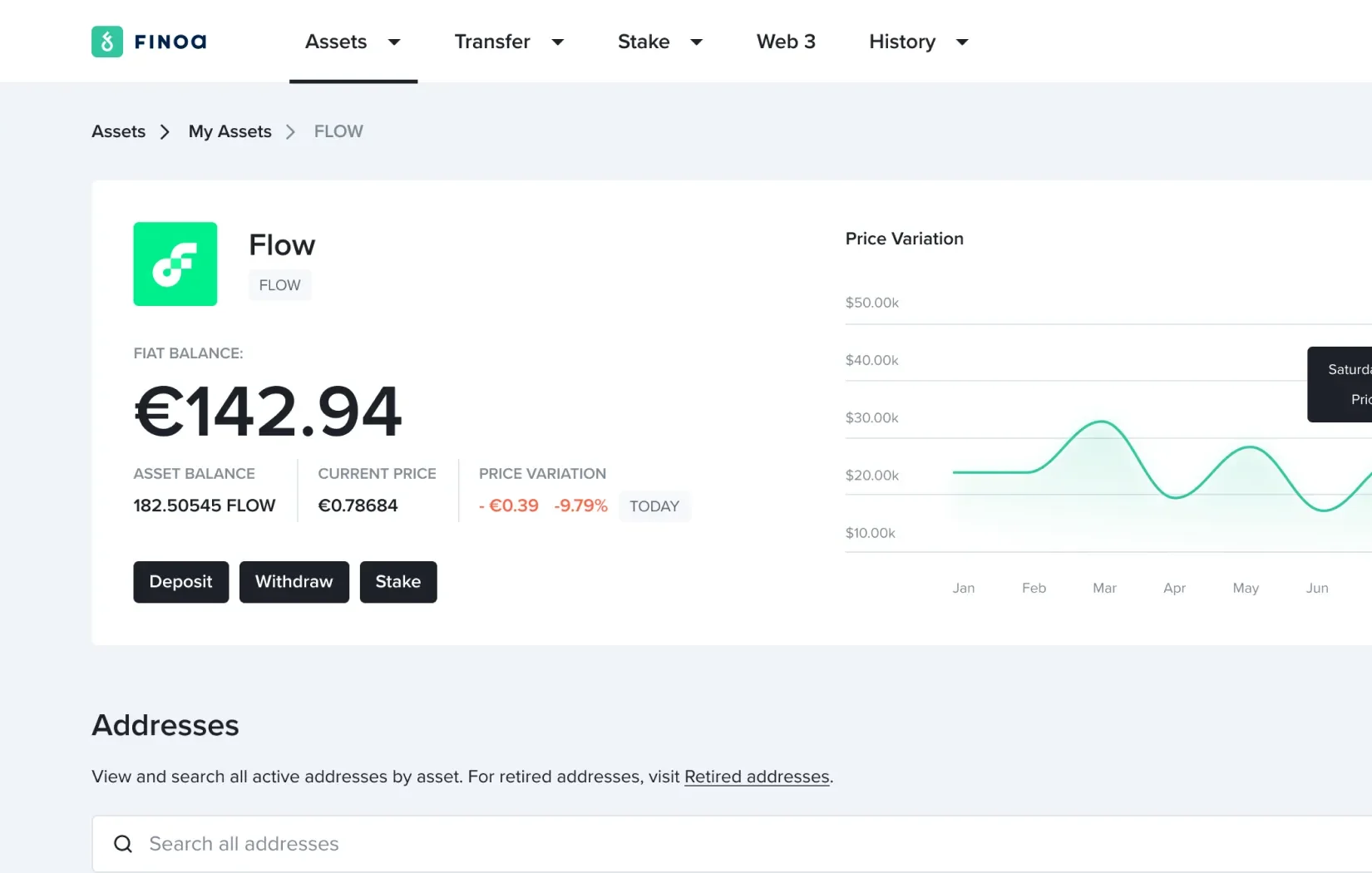
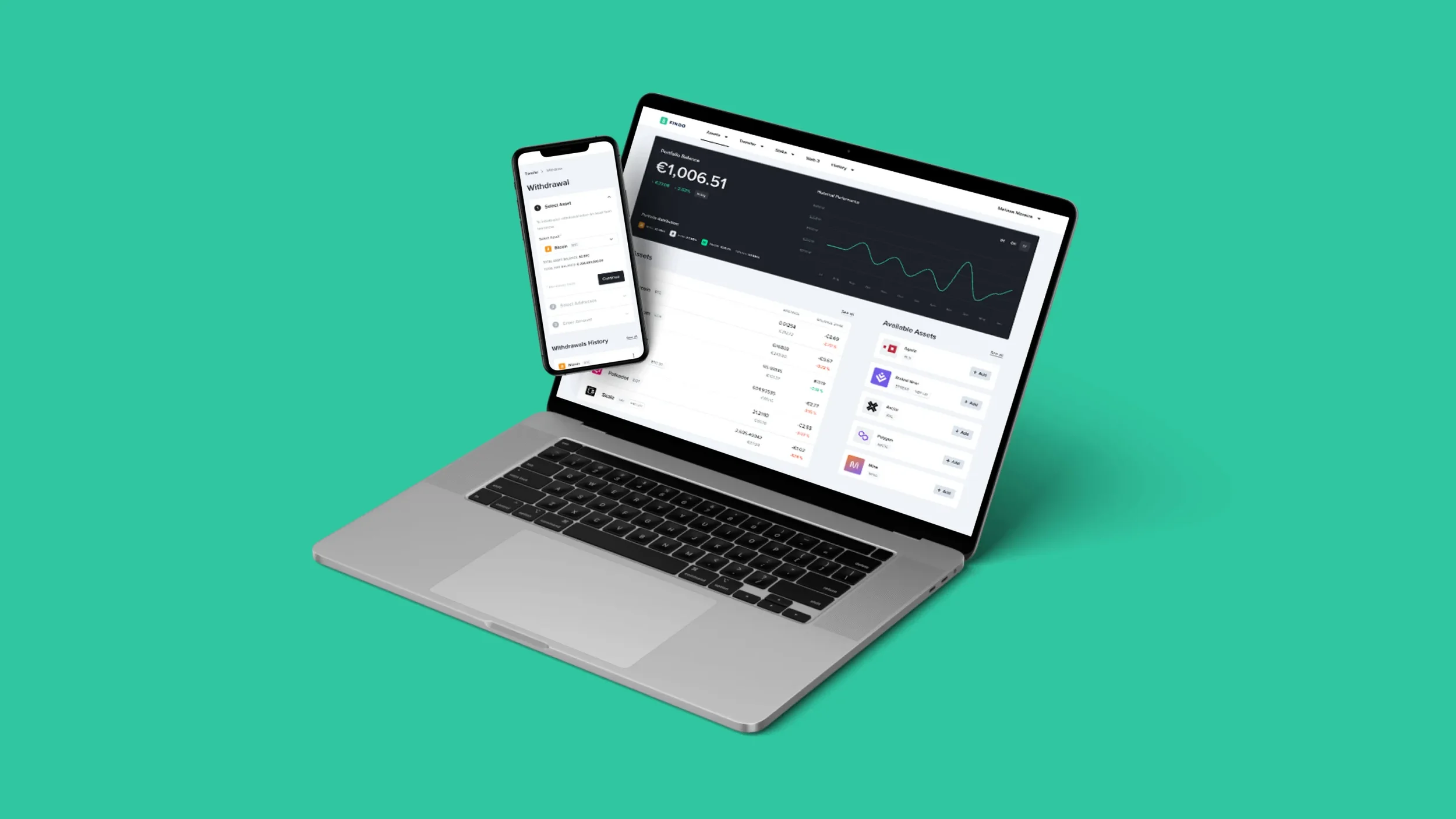
Dedicated token page
The original design made portfolio management confusing, with a flat asset list and wallet creation hidden in the settings. In the redesign, we introduced a dedicated asset page, with quick access to asset keys, and easy addition of new tokens. Users can now easily track performance, manage wallets, and initiate transactions.
Clarity & guidance
Users welcomed helper texts and requested more clarity. We expanded tooltips and contextual explanations throughout flows.
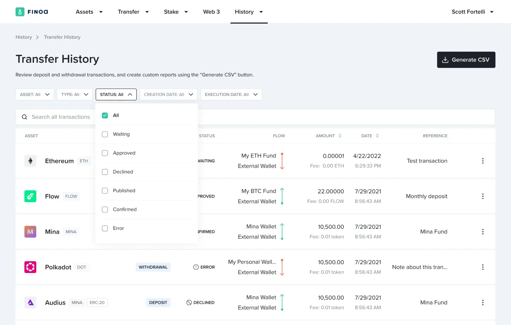
Enhanced reporting
Reporting was appreciated but considered basic. We ensured a full history menu is now visible to build trust, where the customer can track the latest operations he performed (transfers, stake, wallet creation) and to export a file that he can use for documentation or tax purposes.
Help & reassurance
Clients trust Finoa but wanted reassurance. We created a Help Center section covering custody and asset safety, along with instructional videos for each token staking transaction.
Outcome
The redesigned platform transformed Finoa’s experience:
Fresh, adaptable navigation system reflecting Finoa’s current look.
Smooth user flows that reduced complexity.
Reliable ways to handle transactions.
Improved dashboard, interactive elements, accessibility upgrades.
Now anyone, whether they know a lot about digital currencies or are just starting out, can easily handle their crypto.
Reflections
Testing with people - alongside teamwork - showed what works. Our customers’ real-life perspective, combined with thoughts from our own diverse departments, quickly delivered useful discoveries.
The insights we collected guided our creation of an interface that made portfolio management easier, and allowed users to expand their holdings. By prioritizing ease of use, growth potential, and security, the Finoa’s web app redesign turned a previously confusing experience into one that is simple, modern, and enjoyable.
View other projects
KNOK
Designing the future of care
7EGEND